

Art Academy students design 450th anniversary logo
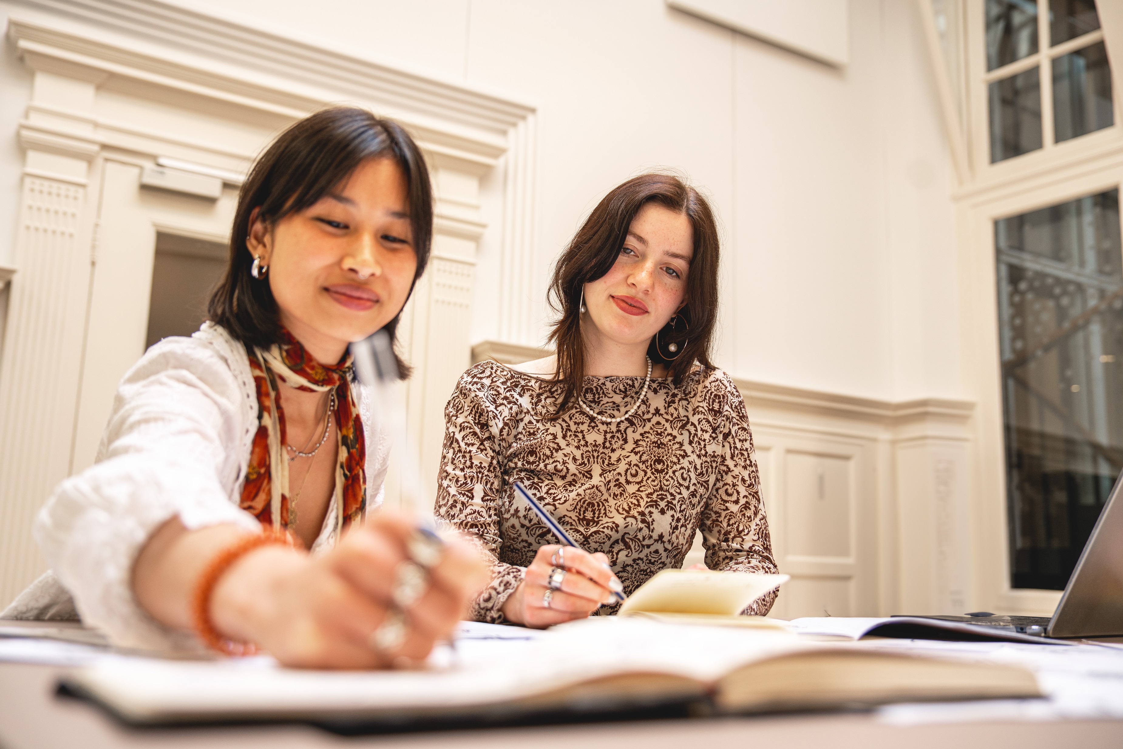
In just a few months Leiden University will be celebrating its 450th anniversary. A celebration like this calls for a fitting logo. And that logo has been designed by Simcha Ziya Moïse van der Veen and Yin Engelaan, students from the Royal Academy of Art The Hague (KABK).
Simcha and Yin won Leiden University’s logo competition for KABK students. The theme of the anniversary, ‘Ahead of the times’, served as inspiration to the pair. They wanted to strike a balance between literal interpretations like clocks or arrows and more abstract forms. ‘We played with the line widths to create more dynamics and flow’, Simcha explains. ‘The slanted lines in the logo generate more movement.’

Logo competition
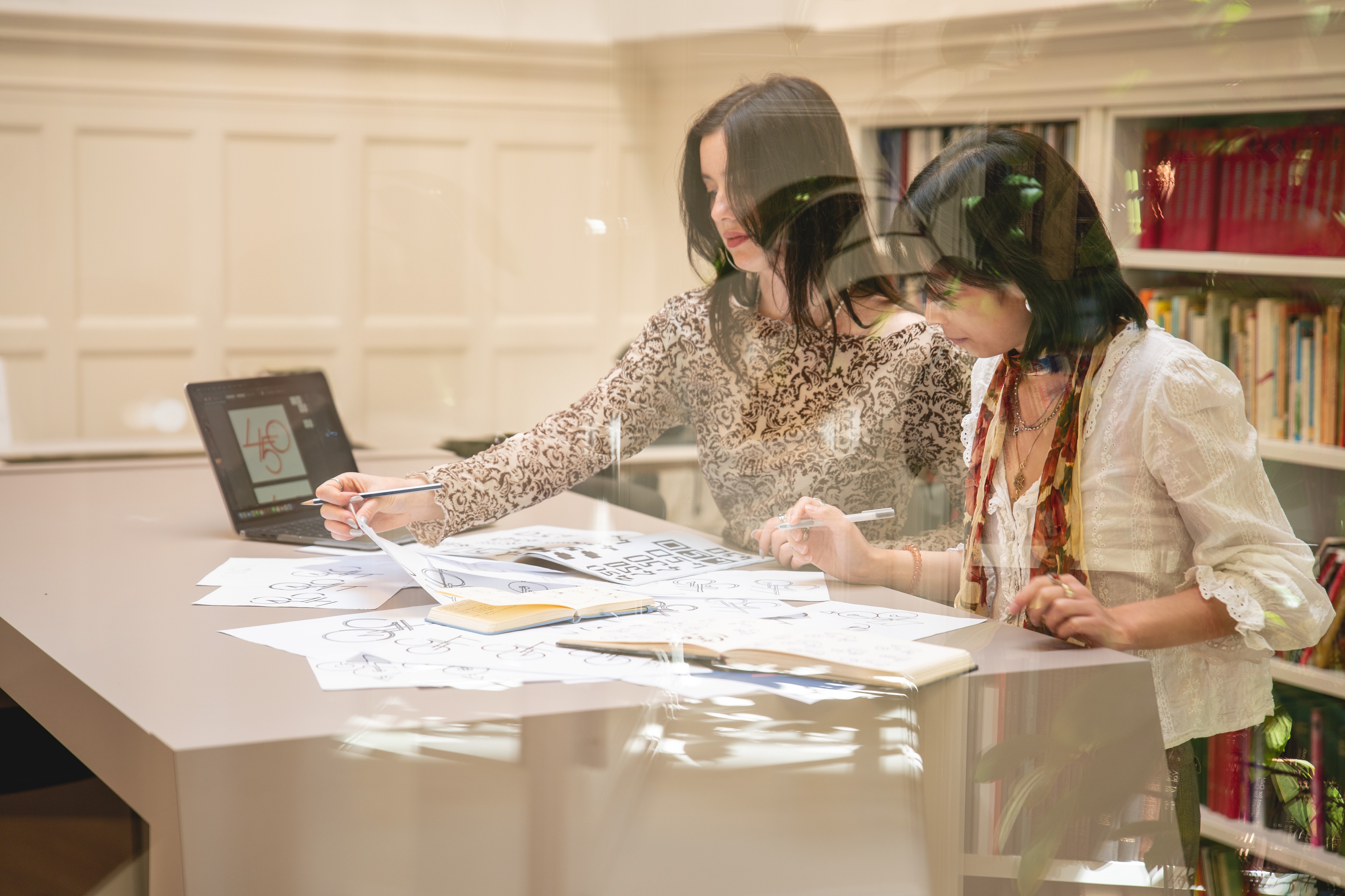
Students from the KABK’s Graphic Design bachelor’s programme spent three months working on their designs, some alone and others in pairs. They all presented their logos to the jury. The jury chose the winning logo for its celebratory feel and surprisingly complex design, and because it matches the university’s visual identity.
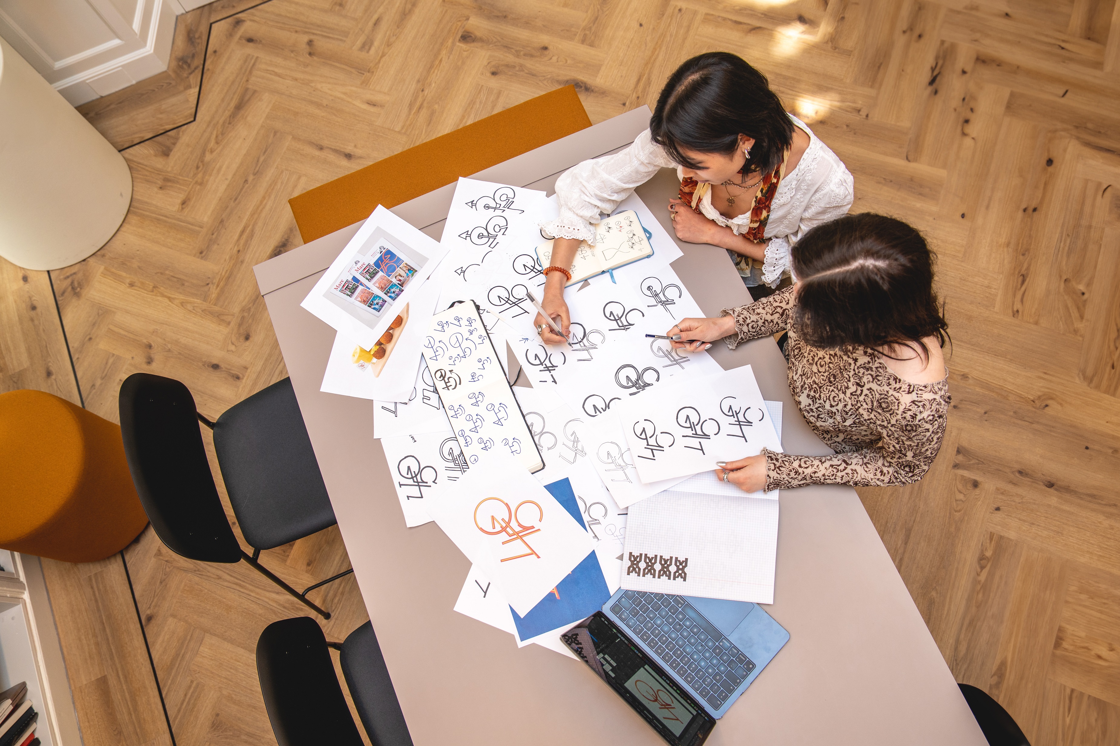
Sketch, sketch and sketch again
The winning duo did the first sketches separately. They soon discovered ways to merge elements from both designs. ‘It was a challenge because we didn’t know the university that well’, says Yin. ‘We thought it was important to create something that fits the university’s traditions and the faculties but above all gives off a party vibe.’
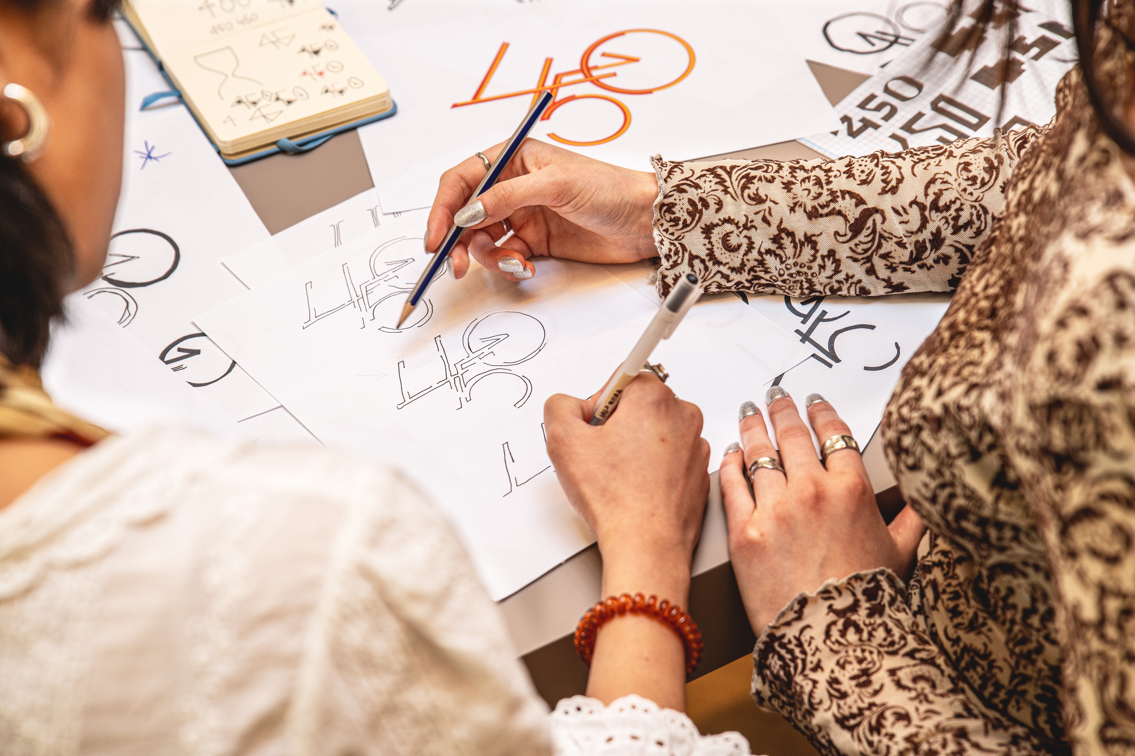
‘And we like how it has become a kind of puzzle, that the more you look at it, the more you see. For instance, how the red-yellow lines look just like gift ribbons’, Simcha adds.
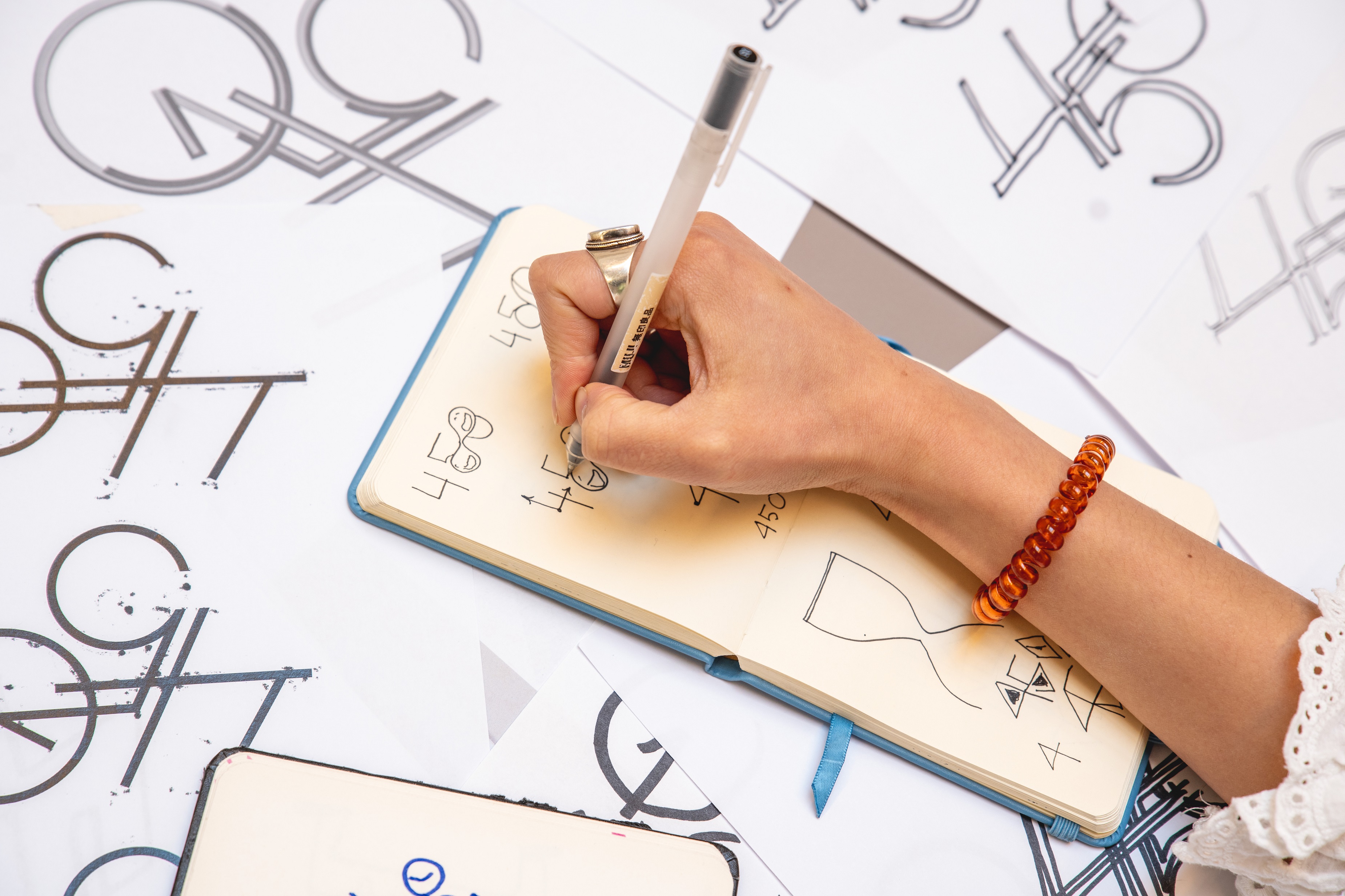
The logo contains a circle with a pointer reminiscent of not just a clock but also an arrow pointing ahead. ‘We made the 5 and 0 round because the university is almost 450 years old and knowledge is constantly acquired and exchanged in a circular way’, Simcha explains. ‘We therefore show that this will continue to happen in the future.’

Bright colours
The students chose red and yellow for the logo because these are colours that say celebration. ‘The logo is a good foil for the university blue. And the yellow really does make the logo pop out of your screen’, says Yin.
They whittled down 100 variations to one final design. This meant trying things over and again, making difficult decisions and reaching compromises. Their opinions differed at times but they managed to find a middle ground. ‘If we hadn’t worked together, the logo would never have looked like it does. We’d never have taken this route alone’, says Simcha.
With their creation, Simcha and Yin have succeeded in depicting the essence of the university’s anniversary. In 2025 we are celebrating our history but are also looking ahead..
The Academy of Arts
Leiden University and the University of the Arts The Hague, consisting of the Royal Conservatoire The Hague and the Royal Academy of Art The Hague (KABK), have worked together in the Academy of Creative and Performing Arts since 2001. Leiden University welcomed the creativity of the KABK students in designing the logo.
The jury comprised: Chantal Hendriksen, Head of the Department of KABK Bachelor in Graphic Design; Márton Kabai, designer and former winner of the logo competition for the university’s 440th anniversary; Renée Merkx, Director of Strategic Communication & Marketing; and web specialist Marcel Villerius.
Text: Jip de Bloois
Photos: Danique ter Horst